Last updated:
HR Teams: Build Recruitment Dashboards Fast With 3–5 KPIs

Applicant Tracking System

The Recruitify Team
A useful recruitment dashboard turns hiring data into business decisions by prioritizing a small set of clean, actionable KPIs fed from your ATS and HRIS. The single highest-priority design decision is not chart style or color scheme, but data quality: pick three to five KPIs, confirm the feed from your applicant tracking system, and only then build the visuals. SHRM’s guidance on recruiting dashboards supports this sequence, and platforms offering integrated ATS and CRM functionality are often built around that same principle.
Focus on selecting three to five high-quality KPIs directly tied to decision-making, such as time-to-hire, cost-per-hire, and offer acceptance rate.
Segment metrics by role, location, and source to avoid misleading averages, ensuring insights reflect specific hiring contexts.
Tailor dashboard views for different audiences, using clear visual hierarchies and filters to facilitate quick understanding and action.
Automate data updates through integrated ATS and HRIS platforms with regular refresh routines, minimizing manual input errors and stale data.
Incorporate alerts, ownership, and review cadence to turn data insights into timely decisions and prevent dashboards from becoming inactivity tools.
RecruitifyBring Recruitment Data TogetherRecruitify combines ATS, Sales CRM, and IT contracting data in one ecosystem for clearer recruitment analytics and fewer administrative tasks.Explore Recruitify
Table of Contents
Core metrics to include and why they matter
Dashboard types and layouts for different audiences
Visual design best practices and common chart choices
How to build practical starter dashboards fast
Pitfalls, red flags, and avoiding vanity metrics
Measuring impact: benchmarks, cadence, and turning insight into action
Practical implementation: what a platform like Recruitify adds
Making dashboards actionable through alerts, owners, and cadence
Best practices for refresh frequency and automation
Bringing qualitative feedback into a quantitative dashboard
Security and privacy considerations for recruitment data
The next phase of recruitment dashboards
How Recruitify can help you build one
Sources
FAQ
Core metrics to include and why they matter
A recruitment dashboard earns its place on someone’s desktop only when each metric on it maps to a decision. Time-to-hire (days from requisition open to offer accepted) tells leadership whether the pipeline is moving fast enough to compete for talent. Time-to-fill (days from requisition open to start date) captures the same urgency from the hiring manager’s seat. Cost-per-hire, calculated as total recruiting spend divided by hires in a period, helps finance and HR decide whether to add headcount or a paid sourcing channel.
Offer acceptance rate, the share of extended offers that candidates accept, flags compensation or candidate-experience problems long before turnover data would. Source-of-hire conversion, tracked from application through hire by channel, tells recruiters which job boards or referral programs to fund next quarter. Pipeline conversion rates between stages (applied to screened, screened to interviewed, interviewed to offer) surface exactly where candidates drop out, which matters more than a raw applicant count. SHRM’s dashboard guidance lists these as the core components worth building a dashboard around.
Quality-of-hire is harder to quantify but worth approximating through proxies: 90-day retention, hiring manager satisfaction scores, or performance review outcomes at the six-month mark.
Segmentation decides whether a KPI is useful or misleading. A single company-wide time-to-hire number hides the fact that engineering roles take longer than administrative ones. Break every metric down by role level, location, and source before presenting it, and choose rates over raw counts whenever team size or requisition volume varies across the comparison.
Time-to-hire and time-to-fill flag leadership when a role is at risk of losing top candidates to competitors.
Cost-per-hire helps finance and recruiting leaders decide whether a channel or agency fee is worth renewing.
Offer acceptance rate signals recruiters and comp teams to review offer packages before losses repeat.
Source-of-hire conversion tells recruiters and marketing which channels deserve more budget.
Pipeline conversion rates point recruiters and hiring managers to the exact stage causing a bottleneck.
Benchmarking context matters here. SHRM’s 2026 recruiting benchmarking research shows requisitions per recruiter rising in larger organizations, a trend worth factoring in before setting internal time-to-fill targets.
Dashboard types and layouts for different audiences
Different audiences need different views, and forcing everyone onto one dashboard is a common reason adoption fails. Four views cover most organizations.
The executive view answers whether hiring is on pace and within budget, using a handful of trend lines and no more than five top-level KPIs. The hiring-manager view answers where their specific requisitions stand, with pipeline funnels and exception alerts for stalled candidates. The recruiter view answers what needs attention today, prioritizing task lists, aging candidates, and interview scheduling gaps. The program or diversity view answers whether sourcing and advancement patterns are equitable across the funnel, using segmented conversion rates rather than headline totals.
Each view benefits from an ordered widget map:
Top three to five KPIs as number cards at the very top, sized for a five-second read.
A funnel chart showing stage-to-stage conversion directly beneath.
An exceptions table listing requisitions or candidates stalled beyond a defined threshold.
An owners and actions column naming who addresses each exception and by when.
Filters and drilldowns belong on the side or top of the dashboard, never buried in a submenu. A recruiter view should let someone filter by requisition or hiring manager in two clicks, while an executive view might only need a quarter and business-unit filter. Drilldowns from a summary chart into the underlying candidate list save recruiters from opening a second system entirely, which is one reason centralizing requisition and pipeline data in a single system pays off before dashboard design even starts.
Visual design best practices and common chart choices
Good recruiting visuals communicate a single point at a glance, and most dashboard failures trace back to violating that rule.
Keep each chart to one message: a funnel for conversion, a line for trend, a bar for comparison.
Use consistent colors for the same metric across every view so recruiters do not relearn the legend each time.
Annotate sample size directly on the chart when a segment has few candidates, since a 100% offer acceptance rate on two offers means something different than on twenty.
Avoid dual axes unless the relationship between the two metrics is the entire point of the chart.
Label axes and data points directly rather than relying on a hover tooltip that mobile users will never see.
Round numbers to a sensible precision; three decimal places on a percentage adds noise, not clarity.
Match the chart to the question. A pipeline leak question calls for a funnel chart. A trend question, such as whether time-to-hire is improving quarter over quarter, calls for a line chart. A source mix question calls for a stacked bar chart broken down by channel. Mixing chart types across a dashboard to look varied, rather than to fit the question, confuses more than it clarifies.
Accessibility deserves attention here too. Use color-blind-safe palettes rather than red-green combinations, add text labels alongside color coding, and show uncertainty honestly, whether through a noted sample size or a shaded confidence band on a trend line, rather than presenting a single point estimate as fact.
Pro Tip: When a segment has fewer than ten candidates, show the raw count next to the percentage. A rate alone can make a small sample look like a trend.
How to build practical starter dashboards fast
Most teams do not need a business intelligence platform on day one. A phased build gets a usable dashboard in front of stakeholders within days.
In Excel, create three base tables: requisitions, candidates by stage, and offers, each pulled or exported from the ATS.
Build a pivot table on the candidate-stage table to calculate stage-to-stage conversion automatically as new data lands.
Add calculated fields for time-to-hire (offer accepted date minus requisition open date) and cost-per-hire (total spend divided by hires) using simple date and division formulas.
Set a weekly refresh routine by re-exporting from the ATS and pasting into a dedicated “raw data” tab, keeping formulas untouched.
Once the Excel version proves useful, translate the same charts into PowerPoint for leadership review. Export the pivot charts as images, apply one consistent template with the same colors and fonts used in Excel, and keep each slide to a single chart with a one-line takeaway underneath.
Use a fixed slide order every reporting cycle so leadership knows what to expect.
Keep the same KPI definitions on every slide as in the underlying Excel file to avoid confusing two audiences with two numbers.
When the Excel version starts requiring daily manual updates or the stakeholder list grows past a handful of people, that is the signal to prototype in Power BI or Tableau. Start the first BI version with the same three or four KPIs from the Excel dashboard rather than expanding scope, since SHRM notes that spreadsheets handle simple dashboards fine, while frequent updates and more complex metrics are where integrated platforms earn their cost.
Pitfalls, red flags, and avoiding vanity metrics
A dashboard full of numbers that make hiring look busy, rather than effective, will get ignored within a month. Applicant volume without a conversion rate is the classic vanity metric: a thousand applicants means nothing if only two make it to interview. Total resumes screened tells a similar half-story without a hire count attached.
Vanity metric example: raw applicant counts with no conversion rate attached, since volume alone does not indicate pipeline health.
Red flag: a sudden spike in hires or a metric that flatlines for weeks, both usually indicating a broken data feed rather than a real trend.
Red flag: two teams reporting different time-to-hire numbers for the same role, which points to conflicting stage definitions, not a calculation error.
Immediate action: trace any implausible spike back to the raw ATS export before presenting it anywhere.
The organizational fix is as important as the technical one. Assign a named owner for each KPI definition, get hiring managers and recruiters to agree on what “time-to-hire” means before the dashboard launches, and set a fixed review cadence so problems surface on a schedule rather than by accident.
Measuring impact: benchmarks, cadence, and turning insight into action
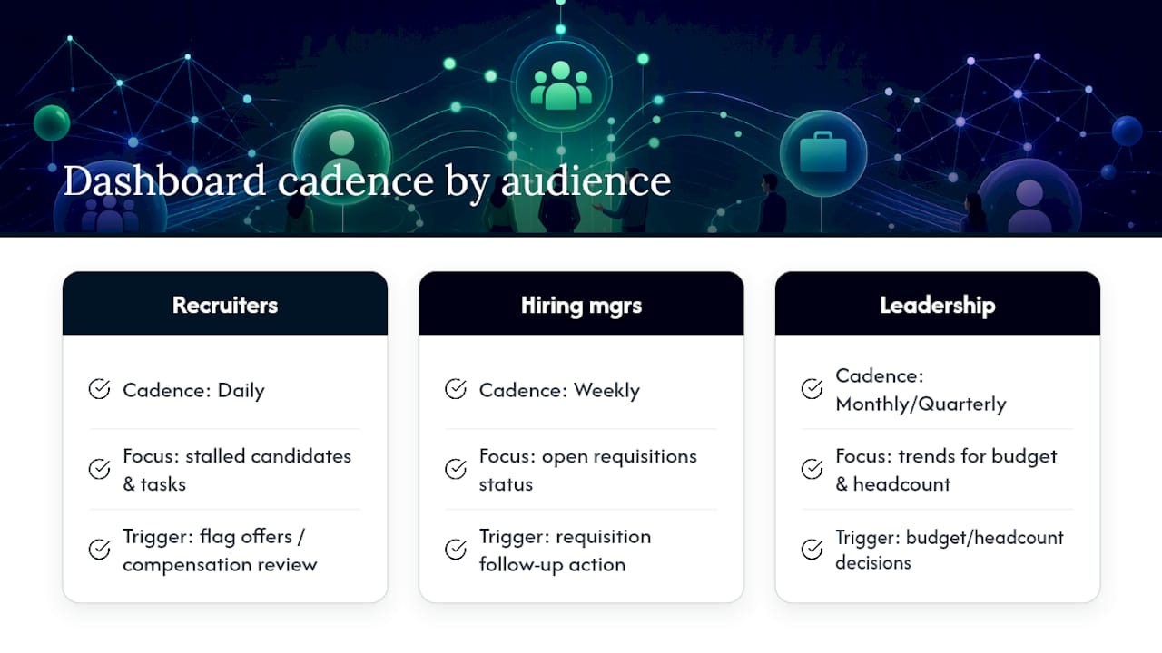
A dashboard only proves its worth when it changes a decision, which means cadence has to match how each audience works. Recruiters need daily visibility into stalled candidates and today’s tasks. Hiring managers need weekly updates on their open requisitions. Leadership needs monthly or quarterly trend views tied to budget and headcount planning.
External benchmarks help set realistic internal targets, with caution. SHRM’s 2026 recruiting benchmarking data provides context for typical time-to-fill and cost-per-hire ranges and shows shifts like higher requisitions per recruiter in larger organizations. Use figures like these as guardrails for setting internal OKRs, not as universal targets, since role complexity and organization size change what “good” looks like.
A time-to-hire trend that breaks its own benchmark for three consecutive weeks is worth a targeted root-cause review, according to the SHRM benchmarking research, which frames such comparators as context rather than fixed rules.
Two example workflows show the pattern in practice. First, when offer acceptance rate drops below its usual range for a specific role family, the dashboard should flag it to both the recruiter and the compensation team, triggering an offer-package review before the next cycle. Second, when a specific sourcing channel’s conversion rate falls while its cost holds steady, the dashboard should prompt a budget reallocation conversation at the next monthly leadership review rather than waiting for the annual planning cycle. IBM Consulting’s research on hiring efficiency makes the same point: successful dashboards need an operational process behind them, with owners and triggers, so that insight actually leads to a decision rather than sitting in a report nobody acts on.
Practical implementation: what a platform like Recruitify adds
Everything described above, clean data, consistent fields, fast refreshes, gets considerably easier with the right infrastructure behind it. Recruitify consolidates the systems most teams juggle separately, which removes several of the data-quality problems covered earlier before they start.
AI CV Parser with OCR extracts structured candidate data from PDFs, scans, and photos in seconds, reducing the manual entry errors that cause dashboard discrepancies.
Contextual Matching AI and scoring generates a percentage match score per candidate, which can feed a quality-of-hire proxy rather than relying on gut feel alone.
Automatic duplicate detection addresses the deduplication step called for in the data-quality checklist above without a manual audit.
GDPR consent management with a Total Audit Trail gives every record digital proof of consent, which matters when sensitive recruitment data feeds a dashboard visible to multiple stakeholders.
Integrated ATS and CRM data means recruiting and sales pipeline data live in one system rather than scattered spreadsheets, simplifying the “single source of truth” problem most dashboard projects run into.
Automation reduces the administrative load that otherwise falls on recruiters trying to keep dashboard inputs current, since consistent status fields and automated refreshes remove the manual re-entry that causes stale or conflicting numbers in the first place.
Making dashboards actionable through alerts, owners, and cadence
A dashboard that only reports numbers, without triggering a next step, becomes wallpaper within a quarter. Actionability starts with alerts: set a threshold, such as a requisition open more than 45 days or an offer acceptance rate dropping below its recent range, and have the dashboard flag it automatically rather than waiting for someone to notice.
Every alert needs an owner. A stalled candidate flag should route to the recruiter managing that requisition, while a channel-level conversion drop should route to whoever controls that sourcing budget. Without a named owner, an exceptions table is just a longer report nobody reads.
Cadence closes the loop. Recruiters should check their view daily, hiring managers weekly, and leadership monthly or quarterly, as covered earlier. The key addition here is a standing meeting or async check-in tied to each cadence, where flagged items get a decision, not just an acknowledgment. IBM’s research on hiring efficiency frames this as the difference between a dashboard with visualizations and one with an operational process wrapped around it, and the second is the one that changes outcomes.
Best practices for refresh frequency and automation
Refresh frequency should match how fast the underlying data changes and how the audience uses it. Recruiter-facing views tracking candidate stage and today’s tasks need daily refreshes at minimum, since stale candidate status leads directly to missed follow-ups. Hiring-manager views can run on a weekly refresh without losing usefulness. Executive trend views hold up fine on a monthly cadence, since a single day’s lag rarely changes a quarterly trend line.
Automation is what makes frequent refreshes sustainable without burning recruiter time on manual exports. A direct export or integration from the ATS and HRIS, rather than manual copy-paste, removes the most common source of stale or duplicated data. Where a full BI platform is not yet justified, a scheduled export routine, even a simple recurring calendar reminder tied to a fixed refresh checklist, keeps a spreadsheet dashboard reliable in the interim.
The practical rule: automate first, then increase frequency. A daily-refreshed dashboard built on a manual process breaks the moment someone goes on vacation. A weekly-refreshed dashboard built on an automated feed is more reliable in practice than a daily one held together by manual habit.
Bringing qualitative feedback into a quantitative dashboard
Numbers alone rarely explain why a metric moved, which is why qualitative signals deserve a place on the dashboard, not just in a separate feedback file. Recruiter notes on why a candidate withdrew, hiring manager comments on interview quality, and candidate experience survey scores all add context that a stage count cannot.
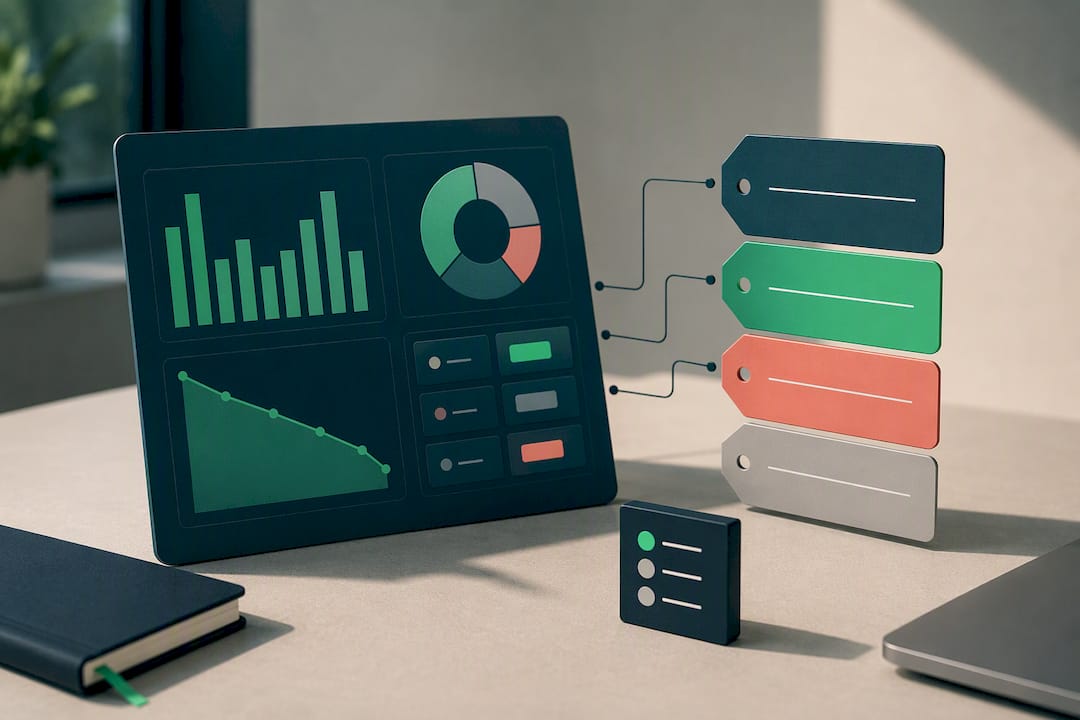
A practical approach is to add a short text or tag field alongside quantitative widgets, showing the top two or three recurring reasons behind a metric’s movement, such as “compensation” or “process delay” tagged against declined offers. IBM Consulting’s guidance on hiring efficiency recommends layering exactly this kind of secondary explanatory data, including candidate feedback and interviewer consistency scores, into program-level dashboards to explain the “why” behind a trend rather than only showing where candidates dropped off.
This does not require a sophisticated sentiment analysis tool to start. A simple tagged dropdown in the ATS at the offer-decline or rejection stage, reviewed monthly alongside the quantitative dashboard, captures most of the value without adding new software to the stack.
Security and privacy considerations for recruitment data
Recruitment dashboards routinely carry sensitive personal data, from compensation history to demographic fields used in diversity reporting, which makes access control a design requirement, not an afterthought. Limit dashboard access by role: a recruiter needs candidate-level detail, while an executive typically only needs aggregated trends.
Anonymize or aggregate any field that could identify an individual candidate before it appears on a broadly shared view, particularly on diversity and program dashboards where small segment sizes can make individuals identifiable even without a name attached. Keep an audit trail of who accessed or exported dashboard data, especially where regional privacy regulation requires demonstrable consent and data handling records.
Building this in from the start avoids a rebuild later. A platform with built-in consent management and audit logging removes the need to bolt on compliance controls after a dashboard is already in wide use, which is typically the harder and more disruptive path.
The next phase of recruitment dashboards
AI-driven match scoring is starting to replace gut-feel quality assessments, and internal mobility metrics are becoming a bigger part of the dashboard conversation as organizations track talent movement, not just external hiring. Data maturity, not tool sophistication, remains the real bottleneck for most teams. Start with a small pilot that ties one or two dashboard signals to a single business outcome, such as offer acceptance tied to compensation review, before expanding scope. Treat the first version as a draft: refine definitions with recruiters and hiring managers every quarter rather than trying to get it perfect before launch.
- Recruitify Team
How Recruitify can help you build one
Some modern platforms consolidate an ATS, sales CRM, and contracting module into one system, which can remove much of the manual reconciliation work described throughout this guide before a single chart gets built. Automation in these platforms can handle many administrative tasks, from candidate categorization to contract generation, reducing the time recruiters spend keeping dashboard data current.
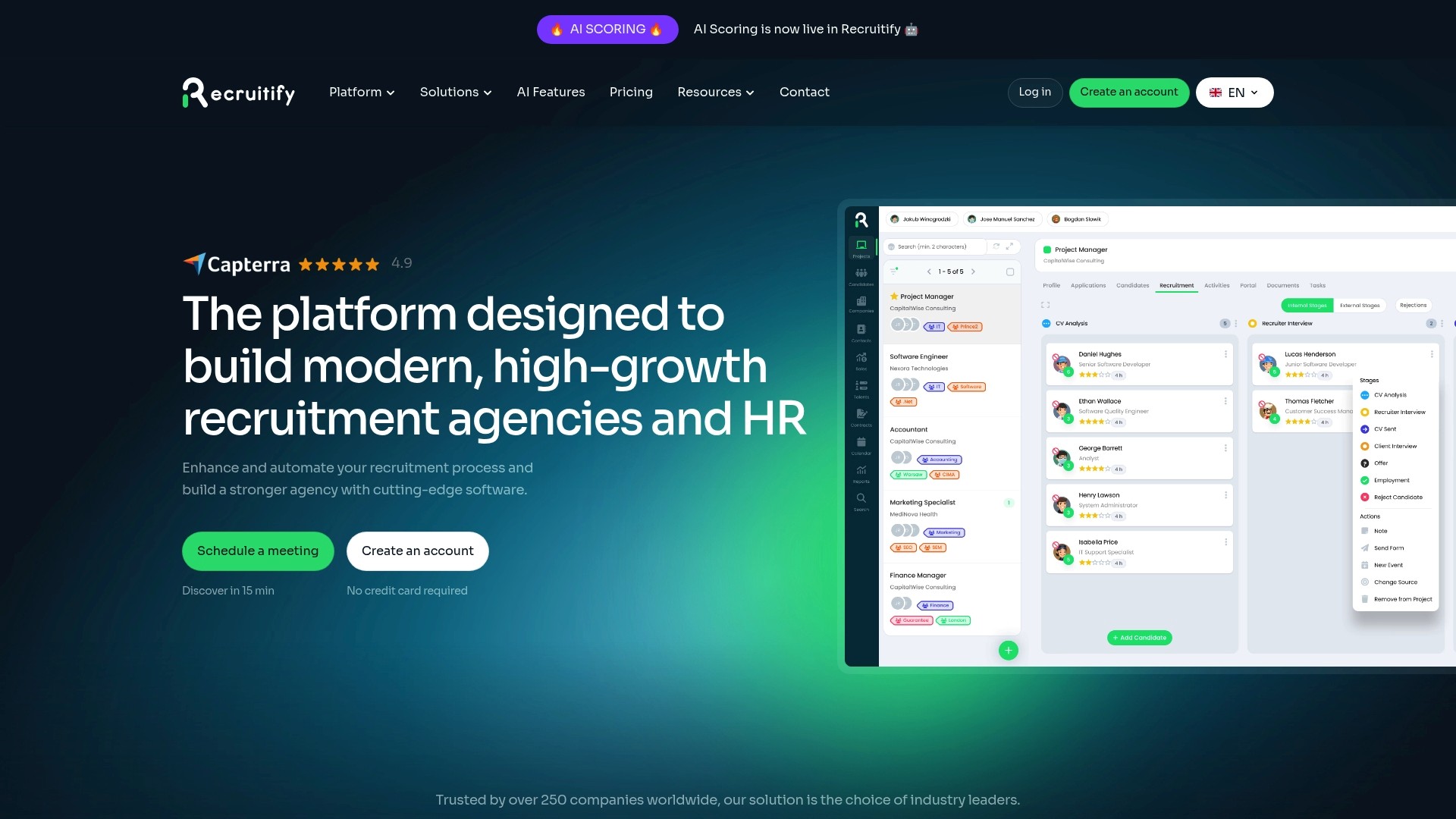
A pilot typically starts with a cleaned data feed from your existing requisitions, a starter set of dashboard templates matched to the KPIs covered above, and a match-score field from the Contextual Matching AI that can serve as a quality-of-hire proxy from day one.
Review the HR Team, Recruitment Agencies, and Enterprise plans to find the fit for your team size.
Explore recruitment automation features that keep dashboard data fresh without manual exports.
Request a demo or start a trial through the pricing page to see how a consolidated data feed changes what your next dashboard review looks like.
Sources
A dashboard is only as trustworthy as the systems feeding it. Four sources typically matter most, and each contributes something the others cannot replicate.
Before any of this feeds a chart, run it through a short quality checklist. Standardize field values so “Rejected” and “Not Selected” are not tracked as two different outcomes. Deduplicate candidate records so a person who applied twice does not inflate applicant counts. Assign a data owner for each field so someone is accountable when a status stops updating. Set a refresh cadence, whether daily or weekly, and stick to it. SHRM notes that establishing this kind of data maturity baseline, consistent status labels, named field owners, and deduplication rules, should come before any predictive or advanced analytics, since without it, models only amplify existing errors.
Common problems have quick fixes. Inconsistent stage names across job requisitions usually mean the ATS configuration needs a one-time cleanup, not a dashboard workaround. Missing source-of-hire data often traces back to a broken UTM tag or a manual entry step recruiters skip under time pressure; automating that capture at the application stage solves it permanently. A structured ATS setup with defined fields from the start avoids most of these issues before they reach a dashboard.
Pro Tip: Audit your ATS field definitions with recruiters and hiring managers before building a single chart. A dashboard built on inconsistent stage names will need rework within weeks.
FAQ
What is a recruitment dashboard?
A recruitment dashboard is a centralized visual collection of hiring metrics, such as time-to-hire, cost-per-hire, and pipeline conversion, that turns raw ATS and HRIS data into decisions recruiters and leaders can act on. According to SHRM, its core components include offer acceptance rates and source-of-hire conversion alongside pipeline health.
How do I make a recruitment dashboard in Excel?
Start with three base tables exported from your ATS: requisitions, candidate stages, and offers, then build a pivot table on the stage data to calculate conversion rates automatically. Add calculated fields for time-to-hire and cost-per-hire, and set a fixed weekly refresh routine to keep the numbers current, as outlined in the starter dashboard steps above.
What are red flags for recruiters to watch on a dashboard?
The clearest red flags are sudden spikes or flatlines in a metric, which usually point to a broken data feed rather than a real shift, and two teams reporting different numbers for the same KPI due to conflicting definitions. Vanity metrics like raw applicant counts without a conversion rate attached are another common warning sign covered in the pitfalls section above.
What are the 7 steps of the recruitment process?
Definitions vary slightly by organization, but a common version covers identifying the need, writing the job description, sourcing candidates, screening applications, interviewing, selecting and extending an offer, and onboarding the new hire. Each of these steps maps to a stage that a well-designed recruitment dashboard should track for conversion and timing.
How often should a recruitment dashboard refresh?
Recruiter-facing views tracking candidate stage need at least a daily refresh, hiring-manager views work well on a weekly cadence, and executive trend views hold up fine monthly. Automating the data feed from your ATS and HRIS, rather than relying on manual exports, is what makes frequent refreshes sustainable, as covered in the refresh and automation section above.
Recommended


News & Updates
Stay up-to-date with the latest innovations, features, and tips about Recruitify!
By providing your email address within the newsletter sign-up form, you confirm its processing to send marketing information regarding the Administrator’s products and services. The Administrator of your personal data processed for the abovementioned purposes is Recruitify Spółka z o.o., based in Warsaw, Poland (KRS 0000709889). For more information on the principles of personal data processing and the rights of data subjects, please check the Privacy Policy.

Last updated:
HR Teams: Build Recruitment Dashboards Fast With 3–5 KPIs
Applicant Tracking System
The Recruitify Team
A useful recruitment dashboard turns hiring data into business decisions by prioritizing a small set of clean, actionable KPIs fed from your ATS and HRIS. The single highest-priority design decision is not chart style or color scheme, but data quality: pick three to five KPIs, confirm the feed from your applicant tracking system, and only then build the visuals. SHRM’s guidance on recruiting dashboards supports this sequence, and platforms offering integrated ATS and CRM functionality are often built around that same principle.
Focus on selecting three to five high-quality KPIs directly tied to decision-making, such as time-to-hire, cost-per-hire, and offer acceptance rate.
Segment metrics by role, location, and source to avoid misleading averages, ensuring insights reflect specific hiring contexts.
Tailor dashboard views for different audiences, using clear visual hierarchies and filters to facilitate quick understanding and action.
Automate data updates through integrated ATS and HRIS platforms with regular refresh routines, minimizing manual input errors and stale data.
Incorporate alerts, ownership, and review cadence to turn data insights into timely decisions and prevent dashboards from becoming inactivity tools.
RecruitifyBring Recruitment Data TogetherRecruitify combines ATS, Sales CRM, and IT contracting data in one ecosystem for clearer recruitment analytics and fewer administrative tasks.Explore Recruitify
Table of Contents
Core metrics to include and why they matter
Dashboard types and layouts for different audiences
Visual design best practices and common chart choices
How to build practical starter dashboards fast
Pitfalls, red flags, and avoiding vanity metrics
Measuring impact: benchmarks, cadence, and turning insight into action
Practical implementation: what a platform like Recruitify adds
Making dashboards actionable through alerts, owners, and cadence
Best practices for refresh frequency and automation
Bringing qualitative feedback into a quantitative dashboard
Security and privacy considerations for recruitment data
The next phase of recruitment dashboards
How Recruitify can help you build one
Sources
FAQ
Core metrics to include and why they matter
A recruitment dashboard earns its place on someone’s desktop only when each metric on it maps to a decision. Time-to-hire (days from requisition open to offer accepted) tells leadership whether the pipeline is moving fast enough to compete for talent. Time-to-fill (days from requisition open to start date) captures the same urgency from the hiring manager’s seat. Cost-per-hire, calculated as total recruiting spend divided by hires in a period, helps finance and HR decide whether to add headcount or a paid sourcing channel.
Offer acceptance rate, the share of extended offers that candidates accept, flags compensation or candidate-experience problems long before turnover data would. Source-of-hire conversion, tracked from application through hire by channel, tells recruiters which job boards or referral programs to fund next quarter. Pipeline conversion rates between stages (applied to screened, screened to interviewed, interviewed to offer) surface exactly where candidates drop out, which matters more than a raw applicant count. SHRM’s dashboard guidance lists these as the core components worth building a dashboard around.
Quality-of-hire is harder to quantify but worth approximating through proxies: 90-day retention, hiring manager satisfaction scores, or performance review outcomes at the six-month mark.
Segmentation decides whether a KPI is useful or misleading. A single company-wide time-to-hire number hides the fact that engineering roles take longer than administrative ones. Break every metric down by role level, location, and source before presenting it, and choose rates over raw counts whenever team size or requisition volume varies across the comparison.
Time-to-hire and time-to-fill flag leadership when a role is at risk of losing top candidates to competitors.
Cost-per-hire helps finance and recruiting leaders decide whether a channel or agency fee is worth renewing.
Offer acceptance rate signals recruiters and comp teams to review offer packages before losses repeat.
Source-of-hire conversion tells recruiters and marketing which channels deserve more budget.
Pipeline conversion rates point recruiters and hiring managers to the exact stage causing a bottleneck.
Benchmarking context matters here. SHRM’s 2026 recruiting benchmarking research shows requisitions per recruiter rising in larger organizations, a trend worth factoring in before setting internal time-to-fill targets.
Dashboard types and layouts for different audiences
Different audiences need different views, and forcing everyone onto one dashboard is a common reason adoption fails. Four views cover most organizations.
The executive view answers whether hiring is on pace and within budget, using a handful of trend lines and no more than five top-level KPIs. The hiring-manager view answers where their specific requisitions stand, with pipeline funnels and exception alerts for stalled candidates. The recruiter view answers what needs attention today, prioritizing task lists, aging candidates, and interview scheduling gaps. The program or diversity view answers whether sourcing and advancement patterns are equitable across the funnel, using segmented conversion rates rather than headline totals.
Each view benefits from an ordered widget map:
Top three to five KPIs as number cards at the very top, sized for a five-second read.
A funnel chart showing stage-to-stage conversion directly beneath.
An exceptions table listing requisitions or candidates stalled beyond a defined threshold.
An owners and actions column naming who addresses each exception and by when.
Filters and drilldowns belong on the side or top of the dashboard, never buried in a submenu. A recruiter view should let someone filter by requisition or hiring manager in two clicks, while an executive view might only need a quarter and business-unit filter. Drilldowns from a summary chart into the underlying candidate list save recruiters from opening a second system entirely, which is one reason centralizing requisition and pipeline data in a single system pays off before dashboard design even starts.
Visual design best practices and common chart choices
Good recruiting visuals communicate a single point at a glance, and most dashboard failures trace back to violating that rule.
Keep each chart to one message: a funnel for conversion, a line for trend, a bar for comparison.
Use consistent colors for the same metric across every view so recruiters do not relearn the legend each time.
Annotate sample size directly on the chart when a segment has few candidates, since a 100% offer acceptance rate on two offers means something different than on twenty.
Avoid dual axes unless the relationship between the two metrics is the entire point of the chart.
Label axes and data points directly rather than relying on a hover tooltip that mobile users will never see.
Round numbers to a sensible precision; three decimal places on a percentage adds noise, not clarity.
Match the chart to the question. A pipeline leak question calls for a funnel chart. A trend question, such as whether time-to-hire is improving quarter over quarter, calls for a line chart. A source mix question calls for a stacked bar chart broken down by channel. Mixing chart types across a dashboard to look varied, rather than to fit the question, confuses more than it clarifies.
Accessibility deserves attention here too. Use color-blind-safe palettes rather than red-green combinations, add text labels alongside color coding, and show uncertainty honestly, whether through a noted sample size or a shaded confidence band on a trend line, rather than presenting a single point estimate as fact.
Pro Tip: When a segment has fewer than ten candidates, show the raw count next to the percentage. A rate alone can make a small sample look like a trend.
How to build practical starter dashboards fast
Most teams do not need a business intelligence platform on day one. A phased build gets a usable dashboard in front of stakeholders within days.
In Excel, create three base tables: requisitions, candidates by stage, and offers, each pulled or exported from the ATS.
Build a pivot table on the candidate-stage table to calculate stage-to-stage conversion automatically as new data lands.
Add calculated fields for time-to-hire (offer accepted date minus requisition open date) and cost-per-hire (total spend divided by hires) using simple date and division formulas.
Set a weekly refresh routine by re-exporting from the ATS and pasting into a dedicated “raw data” tab, keeping formulas untouched.
Once the Excel version proves useful, translate the same charts into PowerPoint for leadership review. Export the pivot charts as images, apply one consistent template with the same colors and fonts used in Excel, and keep each slide to a single chart with a one-line takeaway underneath.
Use a fixed slide order every reporting cycle so leadership knows what to expect.
Keep the same KPI definitions on every slide as in the underlying Excel file to avoid confusing two audiences with two numbers.
When the Excel version starts requiring daily manual updates or the stakeholder list grows past a handful of people, that is the signal to prototype in Power BI or Tableau. Start the first BI version with the same three or four KPIs from the Excel dashboard rather than expanding scope, since SHRM notes that spreadsheets handle simple dashboards fine, while frequent updates and more complex metrics are where integrated platforms earn their cost.
Pitfalls, red flags, and avoiding vanity metrics
A dashboard full of numbers that make hiring look busy, rather than effective, will get ignored within a month. Applicant volume without a conversion rate is the classic vanity metric: a thousand applicants means nothing if only two make it to interview. Total resumes screened tells a similar half-story without a hire count attached.
Vanity metric example: raw applicant counts with no conversion rate attached, since volume alone does not indicate pipeline health.
Red flag: a sudden spike in hires or a metric that flatlines for weeks, both usually indicating a broken data feed rather than a real trend.
Red flag: two teams reporting different time-to-hire numbers for the same role, which points to conflicting stage definitions, not a calculation error.
Immediate action: trace any implausible spike back to the raw ATS export before presenting it anywhere.
The organizational fix is as important as the technical one. Assign a named owner for each KPI definition, get hiring managers and recruiters to agree on what “time-to-hire” means before the dashboard launches, and set a fixed review cadence so problems surface on a schedule rather than by accident.
Measuring impact: benchmarks, cadence, and turning insight into action
A dashboard only proves its worth when it changes a decision, which means cadence has to match how each audience works. Recruiters need daily visibility into stalled candidates and today’s tasks. Hiring managers need weekly updates on their open requisitions. Leadership needs monthly or quarterly trend views tied to budget and headcount planning.
External benchmarks help set realistic internal targets, with caution. SHRM’s 2026 recruiting benchmarking data provides context for typical time-to-fill and cost-per-hire ranges and shows shifts like higher requisitions per recruiter in larger organizations. Use figures like these as guardrails for setting internal OKRs, not as universal targets, since role complexity and organization size change what “good” looks like.
A time-to-hire trend that breaks its own benchmark for three consecutive weeks is worth a targeted root-cause review, according to the SHRM benchmarking research, which frames such comparators as context rather than fixed rules.
Two example workflows show the pattern in practice. First, when offer acceptance rate drops below its usual range for a specific role family, the dashboard should flag it to both the recruiter and the compensation team, triggering an offer-package review before the next cycle. Second, when a specific sourcing channel’s conversion rate falls while its cost holds steady, the dashboard should prompt a budget reallocation conversation at the next monthly leadership review rather than waiting for the annual planning cycle. IBM Consulting’s research on hiring efficiency makes the same point: successful dashboards need an operational process behind them, with owners and triggers, so that insight actually leads to a decision rather than sitting in a report nobody acts on.
Practical implementation: what a platform like Recruitify adds
Everything described above, clean data, consistent fields, fast refreshes, gets considerably easier with the right infrastructure behind it. Recruitify consolidates the systems most teams juggle separately, which removes several of the data-quality problems covered earlier before they start.
AI CV Parser with OCR extracts structured candidate data from PDFs, scans, and photos in seconds, reducing the manual entry errors that cause dashboard discrepancies.
Contextual Matching AI and scoring generates a percentage match score per candidate, which can feed a quality-of-hire proxy rather than relying on gut feel alone.
Automatic duplicate detection addresses the deduplication step called for in the data-quality checklist above without a manual audit.
GDPR consent management with a Total Audit Trail gives every record digital proof of consent, which matters when sensitive recruitment data feeds a dashboard visible to multiple stakeholders.
Integrated ATS and CRM data means recruiting and sales pipeline data live in one system rather than scattered spreadsheets, simplifying the “single source of truth” problem most dashboard projects run into.
Automation reduces the administrative load that otherwise falls on recruiters trying to keep dashboard inputs current, since consistent status fields and automated refreshes remove the manual re-entry that causes stale or conflicting numbers in the first place.
Making dashboards actionable through alerts, owners, and cadence
A dashboard that only reports numbers, without triggering a next step, becomes wallpaper within a quarter. Actionability starts with alerts: set a threshold, such as a requisition open more than 45 days or an offer acceptance rate dropping below its recent range, and have the dashboard flag it automatically rather than waiting for someone to notice.
Every alert needs an owner. A stalled candidate flag should route to the recruiter managing that requisition, while a channel-level conversion drop should route to whoever controls that sourcing budget. Without a named owner, an exceptions table is just a longer report nobody reads.
Cadence closes the loop. Recruiters should check their view daily, hiring managers weekly, and leadership monthly or quarterly, as covered earlier. The key addition here is a standing meeting or async check-in tied to each cadence, where flagged items get a decision, not just an acknowledgment. IBM’s research on hiring efficiency frames this as the difference between a dashboard with visualizations and one with an operational process wrapped around it, and the second is the one that changes outcomes.
Best practices for refresh frequency and automation
Refresh frequency should match how fast the underlying data changes and how the audience uses it. Recruiter-facing views tracking candidate stage and today’s tasks need daily refreshes at minimum, since stale candidate status leads directly to missed follow-ups. Hiring-manager views can run on a weekly refresh without losing usefulness. Executive trend views hold up fine on a monthly cadence, since a single day’s lag rarely changes a quarterly trend line.
Automation is what makes frequent refreshes sustainable without burning recruiter time on manual exports. A direct export or integration from the ATS and HRIS, rather than manual copy-paste, removes the most common source of stale or duplicated data. Where a full BI platform is not yet justified, a scheduled export routine, even a simple recurring calendar reminder tied to a fixed refresh checklist, keeps a spreadsheet dashboard reliable in the interim.
The practical rule: automate first, then increase frequency. A daily-refreshed dashboard built on a manual process breaks the moment someone goes on vacation. A weekly-refreshed dashboard built on an automated feed is more reliable in practice than a daily one held together by manual habit.
Bringing qualitative feedback into a quantitative dashboard
Numbers alone rarely explain why a metric moved, which is why qualitative signals deserve a place on the dashboard, not just in a separate feedback file. Recruiter notes on why a candidate withdrew, hiring manager comments on interview quality, and candidate experience survey scores all add context that a stage count cannot.
A practical approach is to add a short text or tag field alongside quantitative widgets, showing the top two or three recurring reasons behind a metric’s movement, such as “compensation” or “process delay” tagged against declined offers. IBM Consulting’s guidance on hiring efficiency recommends layering exactly this kind of secondary explanatory data, including candidate feedback and interviewer consistency scores, into program-level dashboards to explain the “why” behind a trend rather than only showing where candidates dropped off.
This does not require a sophisticated sentiment analysis tool to start. A simple tagged dropdown in the ATS at the offer-decline or rejection stage, reviewed monthly alongside the quantitative dashboard, captures most of the value without adding new software to the stack.
Security and privacy considerations for recruitment data
Recruitment dashboards routinely carry sensitive personal data, from compensation history to demographic fields used in diversity reporting, which makes access control a design requirement, not an afterthought. Limit dashboard access by role: a recruiter needs candidate-level detail, while an executive typically only needs aggregated trends.
Anonymize or aggregate any field that could identify an individual candidate before it appears on a broadly shared view, particularly on diversity and program dashboards where small segment sizes can make individuals identifiable even without a name attached. Keep an audit trail of who accessed or exported dashboard data, especially where regional privacy regulation requires demonstrable consent and data handling records.
Building this in from the start avoids a rebuild later. A platform with built-in consent management and audit logging removes the need to bolt on compliance controls after a dashboard is already in wide use, which is typically the harder and more disruptive path.
The next phase of recruitment dashboards
AI-driven match scoring is starting to replace gut-feel quality assessments, and internal mobility metrics are becoming a bigger part of the dashboard conversation as organizations track talent movement, not just external hiring. Data maturity, not tool sophistication, remains the real bottleneck for most teams. Start with a small pilot that ties one or two dashboard signals to a single business outcome, such as offer acceptance tied to compensation review, before expanding scope. Treat the first version as a draft: refine definitions with recruiters and hiring managers every quarter rather than trying to get it perfect before launch.
- Recruitify Team
How Recruitify can help you build one
Some modern platforms consolidate an ATS, sales CRM, and contracting module into one system, which can remove much of the manual reconciliation work described throughout this guide before a single chart gets built. Automation in these platforms can handle many administrative tasks, from candidate categorization to contract generation, reducing the time recruiters spend keeping dashboard data current.
A pilot typically starts with a cleaned data feed from your existing requisitions, a starter set of dashboard templates matched to the KPIs covered above, and a match-score field from the Contextual Matching AI that can serve as a quality-of-hire proxy from day one.
Review the HR Team, Recruitment Agencies, and Enterprise plans to find the fit for your team size.
Explore recruitment automation features that keep dashboard data fresh without manual exports.
Request a demo or start a trial through the pricing page to see how a consolidated data feed changes what your next dashboard review looks like.
Sources
A dashboard is only as trustworthy as the systems feeding it. Four sources typically matter most, and each contributes something the others cannot replicate.
Before any of this feeds a chart, run it through a short quality checklist. Standardize field values so “Rejected” and “Not Selected” are not tracked as two different outcomes. Deduplicate candidate records so a person who applied twice does not inflate applicant counts. Assign a data owner for each field so someone is accountable when a status stops updating. Set a refresh cadence, whether daily or weekly, and stick to it. SHRM notes that establishing this kind of data maturity baseline, consistent status labels, named field owners, and deduplication rules, should come before any predictive or advanced analytics, since without it, models only amplify existing errors.
Common problems have quick fixes. Inconsistent stage names across job requisitions usually mean the ATS configuration needs a one-time cleanup, not a dashboard workaround. Missing source-of-hire data often traces back to a broken UTM tag or a manual entry step recruiters skip under time pressure; automating that capture at the application stage solves it permanently. A structured ATS setup with defined fields from the start avoids most of these issues before they reach a dashboard.
Pro Tip: Audit your ATS field definitions with recruiters and hiring managers before building a single chart. A dashboard built on inconsistent stage names will need rework within weeks.
FAQ
What is a recruitment dashboard?
A recruitment dashboard is a centralized visual collection of hiring metrics, such as time-to-hire, cost-per-hire, and pipeline conversion, that turns raw ATS and HRIS data into decisions recruiters and leaders can act on. According to SHRM, its core components include offer acceptance rates and source-of-hire conversion alongside pipeline health.
How do I make a recruitment dashboard in Excel?
Start with three base tables exported from your ATS: requisitions, candidate stages, and offers, then build a pivot table on the stage data to calculate conversion rates automatically. Add calculated fields for time-to-hire and cost-per-hire, and set a fixed weekly refresh routine to keep the numbers current, as outlined in the starter dashboard steps above.
What are red flags for recruiters to watch on a dashboard?
The clearest red flags are sudden spikes or flatlines in a metric, which usually point to a broken data feed rather than a real shift, and two teams reporting different numbers for the same KPI due to conflicting definitions. Vanity metrics like raw applicant counts without a conversion rate attached are another common warning sign covered in the pitfalls section above.
What are the 7 steps of the recruitment process?
Definitions vary slightly by organization, but a common version covers identifying the need, writing the job description, sourcing candidates, screening applications, interviewing, selecting and extending an offer, and onboarding the new hire. Each of these steps maps to a stage that a well-designed recruitment dashboard should track for conversion and timing.
How often should a recruitment dashboard refresh?
Recruiter-facing views tracking candidate stage need at least a daily refresh, hiring-manager views work well on a weekly cadence, and executive trend views hold up fine monthly. Automating the data feed from your ATS and HRIS, rather than relying on manual exports, is what makes frequent refreshes sustainable, as covered in the refresh and automation section above.
Recommended
News & Updates
Stay up-to-date with the latest innovations, features, and tips about Recruitify!
By providing your email address within the newsletter sign-up form, you confirm its processing to send marketing information regarding the Administrator’s products and services. The Administrator of your personal data processed for the abovementioned purposes is Recruitify Spółka z o.o., based in Warsaw, Poland (KRS 0000709889). For more information on the principles of personal data processing and the rights of data subjects, please check the Privacy Policy.
Last updated:
HR Teams: Build Recruitment Dashboards Fast With 3–5 KPIs
Applicant Tracking System
The Recruitify Team
A useful recruitment dashboard turns hiring data into business decisions by prioritizing a small set of clean, actionable KPIs fed from your ATS and HRIS. The single highest-priority design decision is not chart style or color scheme, but data quality: pick three to five KPIs, confirm the feed from your applicant tracking system, and only then build the visuals. SHRM’s guidance on recruiting dashboards supports this sequence, and platforms offering integrated ATS and CRM functionality are often built around that same principle.
Focus on selecting three to five high-quality KPIs directly tied to decision-making, such as time-to-hire, cost-per-hire, and offer acceptance rate.
Segment metrics by role, location, and source to avoid misleading averages, ensuring insights reflect specific hiring contexts.
Tailor dashboard views for different audiences, using clear visual hierarchies and filters to facilitate quick understanding and action.
Automate data updates through integrated ATS and HRIS platforms with regular refresh routines, minimizing manual input errors and stale data.
Incorporate alerts, ownership, and review cadence to turn data insights into timely decisions and prevent dashboards from becoming inactivity tools.
RecruitifyBring Recruitment Data TogetherRecruitify combines ATS, Sales CRM, and IT contracting data in one ecosystem for clearer recruitment analytics and fewer administrative tasks.Explore Recruitify
Table of Contents
Core metrics to include and why they matter
Dashboard types and layouts for different audiences
Visual design best practices and common chart choices
How to build practical starter dashboards fast
Pitfalls, red flags, and avoiding vanity metrics
Measuring impact: benchmarks, cadence, and turning insight into action
Practical implementation: what a platform like Recruitify adds
Making dashboards actionable through alerts, owners, and cadence
Best practices for refresh frequency and automation
Bringing qualitative feedback into a quantitative dashboard
Security and privacy considerations for recruitment data
The next phase of recruitment dashboards
How Recruitify can help you build one
Sources
FAQ
Core metrics to include and why they matter
A recruitment dashboard earns its place on someone’s desktop only when each metric on it maps to a decision. Time-to-hire (days from requisition open to offer accepted) tells leadership whether the pipeline is moving fast enough to compete for talent. Time-to-fill (days from requisition open to start date) captures the same urgency from the hiring manager’s seat. Cost-per-hire, calculated as total recruiting spend divided by hires in a period, helps finance and HR decide whether to add headcount or a paid sourcing channel.
Offer acceptance rate, the share of extended offers that candidates accept, flags compensation or candidate-experience problems long before turnover data would. Source-of-hire conversion, tracked from application through hire by channel, tells recruiters which job boards or referral programs to fund next quarter. Pipeline conversion rates between stages (applied to screened, screened to interviewed, interviewed to offer) surface exactly where candidates drop out, which matters more than a raw applicant count. SHRM’s dashboard guidance lists these as the core components worth building a dashboard around.
Quality-of-hire is harder to quantify but worth approximating through proxies: 90-day retention, hiring manager satisfaction scores, or performance review outcomes at the six-month mark.
Segmentation decides whether a KPI is useful or misleading. A single company-wide time-to-hire number hides the fact that engineering roles take longer than administrative ones. Break every metric down by role level, location, and source before presenting it, and choose rates over raw counts whenever team size or requisition volume varies across the comparison.
Time-to-hire and time-to-fill flag leadership when a role is at risk of losing top candidates to competitors.
Cost-per-hire helps finance and recruiting leaders decide whether a channel or agency fee is worth renewing.
Offer acceptance rate signals recruiters and comp teams to review offer packages before losses repeat.
Source-of-hire conversion tells recruiters and marketing which channels deserve more budget.
Pipeline conversion rates point recruiters and hiring managers to the exact stage causing a bottleneck.
Benchmarking context matters here. SHRM’s 2026 recruiting benchmarking research shows requisitions per recruiter rising in larger organizations, a trend worth factoring in before setting internal time-to-fill targets.
Dashboard types and layouts for different audiences
Different audiences need different views, and forcing everyone onto one dashboard is a common reason adoption fails. Four views cover most organizations.
The executive view answers whether hiring is on pace and within budget, using a handful of trend lines and no more than five top-level KPIs. The hiring-manager view answers where their specific requisitions stand, with pipeline funnels and exception alerts for stalled candidates. The recruiter view answers what needs attention today, prioritizing task lists, aging candidates, and interview scheduling gaps. The program or diversity view answers whether sourcing and advancement patterns are equitable across the funnel, using segmented conversion rates rather than headline totals.
Each view benefits from an ordered widget map:
Top three to five KPIs as number cards at the very top, sized for a five-second read.
A funnel chart showing stage-to-stage conversion directly beneath.
An exceptions table listing requisitions or candidates stalled beyond a defined threshold.
An owners and actions column naming who addresses each exception and by when.
Filters and drilldowns belong on the side or top of the dashboard, never buried in a submenu. A recruiter view should let someone filter by requisition or hiring manager in two clicks, while an executive view might only need a quarter and business-unit filter. Drilldowns from a summary chart into the underlying candidate list save recruiters from opening a second system entirely, which is one reason centralizing requisition and pipeline data in a single system pays off before dashboard design even starts.
Visual design best practices and common chart choices
Good recruiting visuals communicate a single point at a glance, and most dashboard failures trace back to violating that rule.
Keep each chart to one message: a funnel for conversion, a line for trend, a bar for comparison.
Use consistent colors for the same metric across every view so recruiters do not relearn the legend each time.
Annotate sample size directly on the chart when a segment has few candidates, since a 100% offer acceptance rate on two offers means something different than on twenty.
Avoid dual axes unless the relationship between the two metrics is the entire point of the chart.
Label axes and data points directly rather than relying on a hover tooltip that mobile users will never see.
Round numbers to a sensible precision; three decimal places on a percentage adds noise, not clarity.
Match the chart to the question. A pipeline leak question calls for a funnel chart. A trend question, such as whether time-to-hire is improving quarter over quarter, calls for a line chart. A source mix question calls for a stacked bar chart broken down by channel. Mixing chart types across a dashboard to look varied, rather than to fit the question, confuses more than it clarifies.
Accessibility deserves attention here too. Use color-blind-safe palettes rather than red-green combinations, add text labels alongside color coding, and show uncertainty honestly, whether through a noted sample size or a shaded confidence band on a trend line, rather than presenting a single point estimate as fact.
Pro Tip: When a segment has fewer than ten candidates, show the raw count next to the percentage. A rate alone can make a small sample look like a trend.
How to build practical starter dashboards fast
Most teams do not need a business intelligence platform on day one. A phased build gets a usable dashboard in front of stakeholders within days.
In Excel, create three base tables: requisitions, candidates by stage, and offers, each pulled or exported from the ATS.
Build a pivot table on the candidate-stage table to calculate stage-to-stage conversion automatically as new data lands.
Add calculated fields for time-to-hire (offer accepted date minus requisition open date) and cost-per-hire (total spend divided by hires) using simple date and division formulas.
Set a weekly refresh routine by re-exporting from the ATS and pasting into a dedicated “raw data” tab, keeping formulas untouched.
Once the Excel version proves useful, translate the same charts into PowerPoint for leadership review. Export the pivot charts as images, apply one consistent template with the same colors and fonts used in Excel, and keep each slide to a single chart with a one-line takeaway underneath.
Use a fixed slide order every reporting cycle so leadership knows what to expect.
Keep the same KPI definitions on every slide as in the underlying Excel file to avoid confusing two audiences with two numbers.
When the Excel version starts requiring daily manual updates or the stakeholder list grows past a handful of people, that is the signal to prototype in Power BI or Tableau. Start the first BI version with the same three or four KPIs from the Excel dashboard rather than expanding scope, since SHRM notes that spreadsheets handle simple dashboards fine, while frequent updates and more complex metrics are where integrated platforms earn their cost.
Pitfalls, red flags, and avoiding vanity metrics
A dashboard full of numbers that make hiring look busy, rather than effective, will get ignored within a month. Applicant volume without a conversion rate is the classic vanity metric: a thousand applicants means nothing if only two make it to interview. Total resumes screened tells a similar half-story without a hire count attached.
Vanity metric example: raw applicant counts with no conversion rate attached, since volume alone does not indicate pipeline health.
Red flag: a sudden spike in hires or a metric that flatlines for weeks, both usually indicating a broken data feed rather than a real trend.
Red flag: two teams reporting different time-to-hire numbers for the same role, which points to conflicting stage definitions, not a calculation error.
Immediate action: trace any implausible spike back to the raw ATS export before presenting it anywhere.
The organizational fix is as important as the technical one. Assign a named owner for each KPI definition, get hiring managers and recruiters to agree on what “time-to-hire” means before the dashboard launches, and set a fixed review cadence so problems surface on a schedule rather than by accident.
Measuring impact: benchmarks, cadence, and turning insight into action
A dashboard only proves its worth when it changes a decision, which means cadence has to match how each audience works. Recruiters need daily visibility into stalled candidates and today’s tasks. Hiring managers need weekly updates on their open requisitions. Leadership needs monthly or quarterly trend views tied to budget and headcount planning.
External benchmarks help set realistic internal targets, with caution. SHRM’s 2026 recruiting benchmarking data provides context for typical time-to-fill and cost-per-hire ranges and shows shifts like higher requisitions per recruiter in larger organizations. Use figures like these as guardrails for setting internal OKRs, not as universal targets, since role complexity and organization size change what “good” looks like.
A time-to-hire trend that breaks its own benchmark for three consecutive weeks is worth a targeted root-cause review, according to the SHRM benchmarking research, which frames such comparators as context rather than fixed rules.
Two example workflows show the pattern in practice. First, when offer acceptance rate drops below its usual range for a specific role family, the dashboard should flag it to both the recruiter and the compensation team, triggering an offer-package review before the next cycle. Second, when a specific sourcing channel’s conversion rate falls while its cost holds steady, the dashboard should prompt a budget reallocation conversation at the next monthly leadership review rather than waiting for the annual planning cycle. IBM Consulting’s research on hiring efficiency makes the same point: successful dashboards need an operational process behind them, with owners and triggers, so that insight actually leads to a decision rather than sitting in a report nobody acts on.
Practical implementation: what a platform like Recruitify adds
Everything described above, clean data, consistent fields, fast refreshes, gets considerably easier with the right infrastructure behind it. Recruitify consolidates the systems most teams juggle separately, which removes several of the data-quality problems covered earlier before they start.
AI CV Parser with OCR extracts structured candidate data from PDFs, scans, and photos in seconds, reducing the manual entry errors that cause dashboard discrepancies.
Contextual Matching AI and scoring generates a percentage match score per candidate, which can feed a quality-of-hire proxy rather than relying on gut feel alone.
Automatic duplicate detection addresses the deduplication step called for in the data-quality checklist above without a manual audit.
GDPR consent management with a Total Audit Trail gives every record digital proof of consent, which matters when sensitive recruitment data feeds a dashboard visible to multiple stakeholders.
Integrated ATS and CRM data means recruiting and sales pipeline data live in one system rather than scattered spreadsheets, simplifying the “single source of truth” problem most dashboard projects run into.
Automation reduces the administrative load that otherwise falls on recruiters trying to keep dashboard inputs current, since consistent status fields and automated refreshes remove the manual re-entry that causes stale or conflicting numbers in the first place.
Making dashboards actionable through alerts, owners, and cadence
A dashboard that only reports numbers, without triggering a next step, becomes wallpaper within a quarter. Actionability starts with alerts: set a threshold, such as a requisition open more than 45 days or an offer acceptance rate dropping below its recent range, and have the dashboard flag it automatically rather than waiting for someone to notice.
Every alert needs an owner. A stalled candidate flag should route to the recruiter managing that requisition, while a channel-level conversion drop should route to whoever controls that sourcing budget. Without a named owner, an exceptions table is just a longer report nobody reads.
Cadence closes the loop. Recruiters should check their view daily, hiring managers weekly, and leadership monthly or quarterly, as covered earlier. The key addition here is a standing meeting or async check-in tied to each cadence, where flagged items get a decision, not just an acknowledgment. IBM’s research on hiring efficiency frames this as the difference between a dashboard with visualizations and one with an operational process wrapped around it, and the second is the one that changes outcomes.
Best practices for refresh frequency and automation
Refresh frequency should match how fast the underlying data changes and how the audience uses it. Recruiter-facing views tracking candidate stage and today’s tasks need daily refreshes at minimum, since stale candidate status leads directly to missed follow-ups. Hiring-manager views can run on a weekly refresh without losing usefulness. Executive trend views hold up fine on a monthly cadence, since a single day’s lag rarely changes a quarterly trend line.
Automation is what makes frequent refreshes sustainable without burning recruiter time on manual exports. A direct export or integration from the ATS and HRIS, rather than manual copy-paste, removes the most common source of stale or duplicated data. Where a full BI platform is not yet justified, a scheduled export routine, even a simple recurring calendar reminder tied to a fixed refresh checklist, keeps a spreadsheet dashboard reliable in the interim.
The practical rule: automate first, then increase frequency. A daily-refreshed dashboard built on a manual process breaks the moment someone goes on vacation. A weekly-refreshed dashboard built on an automated feed is more reliable in practice than a daily one held together by manual habit.
Bringing qualitative feedback into a quantitative dashboard
Numbers alone rarely explain why a metric moved, which is why qualitative signals deserve a place on the dashboard, not just in a separate feedback file. Recruiter notes on why a candidate withdrew, hiring manager comments on interview quality, and candidate experience survey scores all add context that a stage count cannot.
A practical approach is to add a short text or tag field alongside quantitative widgets, showing the top two or three recurring reasons behind a metric’s movement, such as “compensation” or “process delay” tagged against declined offers. IBM Consulting’s guidance on hiring efficiency recommends layering exactly this kind of secondary explanatory data, including candidate feedback and interviewer consistency scores, into program-level dashboards to explain the “why” behind a trend rather than only showing where candidates dropped off.
This does not require a sophisticated sentiment analysis tool to start. A simple tagged dropdown in the ATS at the offer-decline or rejection stage, reviewed monthly alongside the quantitative dashboard, captures most of the value without adding new software to the stack.
Security and privacy considerations for recruitment data
Recruitment dashboards routinely carry sensitive personal data, from compensation history to demographic fields used in diversity reporting, which makes access control a design requirement, not an afterthought. Limit dashboard access by role: a recruiter needs candidate-level detail, while an executive typically only needs aggregated trends.
Anonymize or aggregate any field that could identify an individual candidate before it appears on a broadly shared view, particularly on diversity and program dashboards where small segment sizes can make individuals identifiable even without a name attached. Keep an audit trail of who accessed or exported dashboard data, especially where regional privacy regulation requires demonstrable consent and data handling records.
Building this in from the start avoids a rebuild later. A platform with built-in consent management and audit logging removes the need to bolt on compliance controls after a dashboard is already in wide use, which is typically the harder and more disruptive path.
The next phase of recruitment dashboards
AI-driven match scoring is starting to replace gut-feel quality assessments, and internal mobility metrics are becoming a bigger part of the dashboard conversation as organizations track talent movement, not just external hiring. Data maturity, not tool sophistication, remains the real bottleneck for most teams. Start with a small pilot that ties one or two dashboard signals to a single business outcome, such as offer acceptance tied to compensation review, before expanding scope. Treat the first version as a draft: refine definitions with recruiters and hiring managers every quarter rather than trying to get it perfect before launch.
- Recruitify Team
How Recruitify can help you build one
Some modern platforms consolidate an ATS, sales CRM, and contracting module into one system, which can remove much of the manual reconciliation work described throughout this guide before a single chart gets built. Automation in these platforms can handle many administrative tasks, from candidate categorization to contract generation, reducing the time recruiters spend keeping dashboard data current.
A pilot typically starts with a cleaned data feed from your existing requisitions, a starter set of dashboard templates matched to the KPIs covered above, and a match-score field from the Contextual Matching AI that can serve as a quality-of-hire proxy from day one.
Review the HR Team, Recruitment Agencies, and Enterprise plans to find the fit for your team size.
Explore recruitment automation features that keep dashboard data fresh without manual exports.
Request a demo or start a trial through the pricing page to see how a consolidated data feed changes what your next dashboard review looks like.
Sources
A dashboard is only as trustworthy as the systems feeding it. Four sources typically matter most, and each contributes something the others cannot replicate.
Before any of this feeds a chart, run it through a short quality checklist. Standardize field values so “Rejected” and “Not Selected” are not tracked as two different outcomes. Deduplicate candidate records so a person who applied twice does not inflate applicant counts. Assign a data owner for each field so someone is accountable when a status stops updating. Set a refresh cadence, whether daily or weekly, and stick to it. SHRM notes that establishing this kind of data maturity baseline, consistent status labels, named field owners, and deduplication rules, should come before any predictive or advanced analytics, since without it, models only amplify existing errors.
Common problems have quick fixes. Inconsistent stage names across job requisitions usually mean the ATS configuration needs a one-time cleanup, not a dashboard workaround. Missing source-of-hire data often traces back to a broken UTM tag or a manual entry step recruiters skip under time pressure; automating that capture at the application stage solves it permanently. A structured ATS setup with defined fields from the start avoids most of these issues before they reach a dashboard.
Pro Tip: Audit your ATS field definitions with recruiters and hiring managers before building a single chart. A dashboard built on inconsistent stage names will need rework within weeks.
FAQ
What is a recruitment dashboard?
A recruitment dashboard is a centralized visual collection of hiring metrics, such as time-to-hire, cost-per-hire, and pipeline conversion, that turns raw ATS and HRIS data into decisions recruiters and leaders can act on. According to SHRM, its core components include offer acceptance rates and source-of-hire conversion alongside pipeline health.
How do I make a recruitment dashboard in Excel?
Start with three base tables exported from your ATS: requisitions, candidate stages, and offers, then build a pivot table on the stage data to calculate conversion rates automatically. Add calculated fields for time-to-hire and cost-per-hire, and set a fixed weekly refresh routine to keep the numbers current, as outlined in the starter dashboard steps above.
What are red flags for recruiters to watch on a dashboard?
The clearest red flags are sudden spikes or flatlines in a metric, which usually point to a broken data feed rather than a real shift, and two teams reporting different numbers for the same KPI due to conflicting definitions. Vanity metrics like raw applicant counts without a conversion rate attached are another common warning sign covered in the pitfalls section above.
What are the 7 steps of the recruitment process?
Definitions vary slightly by organization, but a common version covers identifying the need, writing the job description, sourcing candidates, screening applications, interviewing, selecting and extending an offer, and onboarding the new hire. Each of these steps maps to a stage that a well-designed recruitment dashboard should track for conversion and timing.
How often should a recruitment dashboard refresh?
Recruiter-facing views tracking candidate stage need at least a daily refresh, hiring-manager views work well on a weekly cadence, and executive trend views hold up fine monthly. Automating the data feed from your ATS and HRIS, rather than relying on manual exports, is what makes frequent refreshes sustainable, as covered in the refresh and automation section above.
Recommended
News & Updates
Stay up-to-date with the latest innovations, features, and tips about Recruitify!
By providing your email address within the newsletter sign-up form, you confirm its processing to send marketing information regarding the Administrator’s products and services. The Administrator of your personal data processed for the abovementioned purposes is Recruitify Spółka z o.o., based in Warsaw, Poland (KRS 0000709889). For more information on the principles of personal data processing and the rights of data subjects, please check the Privacy Policy.

Discover More

Applicant Tracking System
Cut Screening Time 70%: Six Phase Remote Hiring Process for HR Teams
Redesign your remote hiring process with an async first six phase workflow, practical templates, and automation that can cut screening time 70%.
27 Sept 2026
Discover More

Applicant Tracking System
Prove Channel ROI in 90 Days, Recruiters Using Source of Hire Tracking
Practical playbook for recruiters to enforce ATS tagging, attribution rules, and dashboards tying source of hire to cost, time to hire, and 12 month...
26 Sept 2026
Discover More

Recruitment Process
Cut Apply Time to 90 Seconds: Mobile Recruiting Strategy for TA Teams
Mobile recruiting strategy for TA teams: cut apply time under 90 seconds, track device level metrics, and fix your funnel in three sprints.
25 Sept 2026
Discover More
Applicant Tracking System
Cut Screening Time 70%: Six Phase Remote Hiring Process for HR Teams
Redesign your remote hiring process with an async first six phase workflow, practical templates, and automation that can cut screening time 70%.
27 Sept 2026
Discover More
Applicant Tracking System
Prove Channel ROI in 90 Days, Recruiters Using Source of Hire Tracking
Practical playbook for recruiters to enforce ATS tagging, attribution rules, and dashboards tying source of hire to cost, time to hire, and 12 month...
26 Sept 2026
Discover More